UX - Mobile & Desktop
The Sandwich Shop Ordering App
An order placing app for a fictional sandwich shop. The goal was to create a workflow where users could easily select an item, customize it, and complete purchase.
My Responsibilities
Conducting interviews, paper and digital wireframing, low and high-fidelity prototyping, conducting usability studies, accounting for accessibility, and iterating on designs.
Users and Research
I conducted interviews and created empathy maps to understand the users I’m
designing for and their needs. A primary user group identified through research
was working adults who don’t have time to cook meals.
The Design Process
I started the design process with creating hand drawn wireframes in order to easily iterate on many design variations.
Digital Wireframes
I then moved onto converting the paper wireframes to digital wireframes and start the prototyping process.
Usability Study
I tested the prototype in a blind user study. The initial feedback allowed me to improve the user experience by adjusting text size, adding more contrast to buttons, and incorporating a back button.
LoFi to HiFi
After incorporating the feedback from the usability study I started to build out the rest of the screens with graphics, images, and color.
2nd Usability Study
After testing the HiFi prototype, feedback I received was that the green color I choose was hard for some users to see so I swapped the light green color in favor of a darker orange.
Conclusion
My takeaways from this project is the importance of usability studies but also to not forget the little details like a specific color code that may impact the user’s experience.
Paper Wireframes
LoFi Prototype
HiFi Screens
The Design Process
I started the design process with creating hand drawn wireframes for a desktop display then moved onto a mobile responsive design.
Digital Wireframes
I then moved onto converting the paper wireframes to digital wireframes and start the prototyping process.
Usability Study
I tested the prototype in a blind user study. The initial feedback allowed me to improve the user experience by decreasing text size and adjusting the scroll position to not jump to top of the page.
LoFi to HiFi
After incorporating the feedback from the usability study I started to build out the rest of the screens with graphics, images, and color.
Conclusion
My takeaways from this project is the importance of usability studies but also to not forget the little details like a specific color code that may impact the user’s experience.
Notepad for Culinary Arts University
Charlotte Culinary Arts University (fictional) would like to build a note taking application that their students can use. Unlike already existing note taking apps, this particular app needs to be geared to suit the specific needs of culinary students.
My Responsibilities
Conducting interviews, paper and digital wireframing, low and high-fidelity prototyping, conducting usability studies, accounting for accessibility, and iterating on designs.
Users and Research
A primary user group identified through research was students and students who are working.
Paper Wireframes
LoFi Prototype
The Design Process
I started the design process with creating hand drawn wireframes for a desktop display then moved onto a mobile responsive design.
Digital Wireframes
I then moved onto converting the paper wireframes to digital wireframes and start the prototyping process.
Usability Study
I tested the prototype in a blind user study. The initial feedback allowed me to improve the user experience by paying close attention to text hierarchy considering the amount of text on the website.
LoFi to HiFi
After incorporating the feedback from the usability study I started to build out the rest of the screens with graphics, images, and color.
Conclusion
My takeaways from this project are that when designing content-heavy websites and applications there needs to be strong text hierarchy in order to not overwhelm the user with content so they can complete their task.
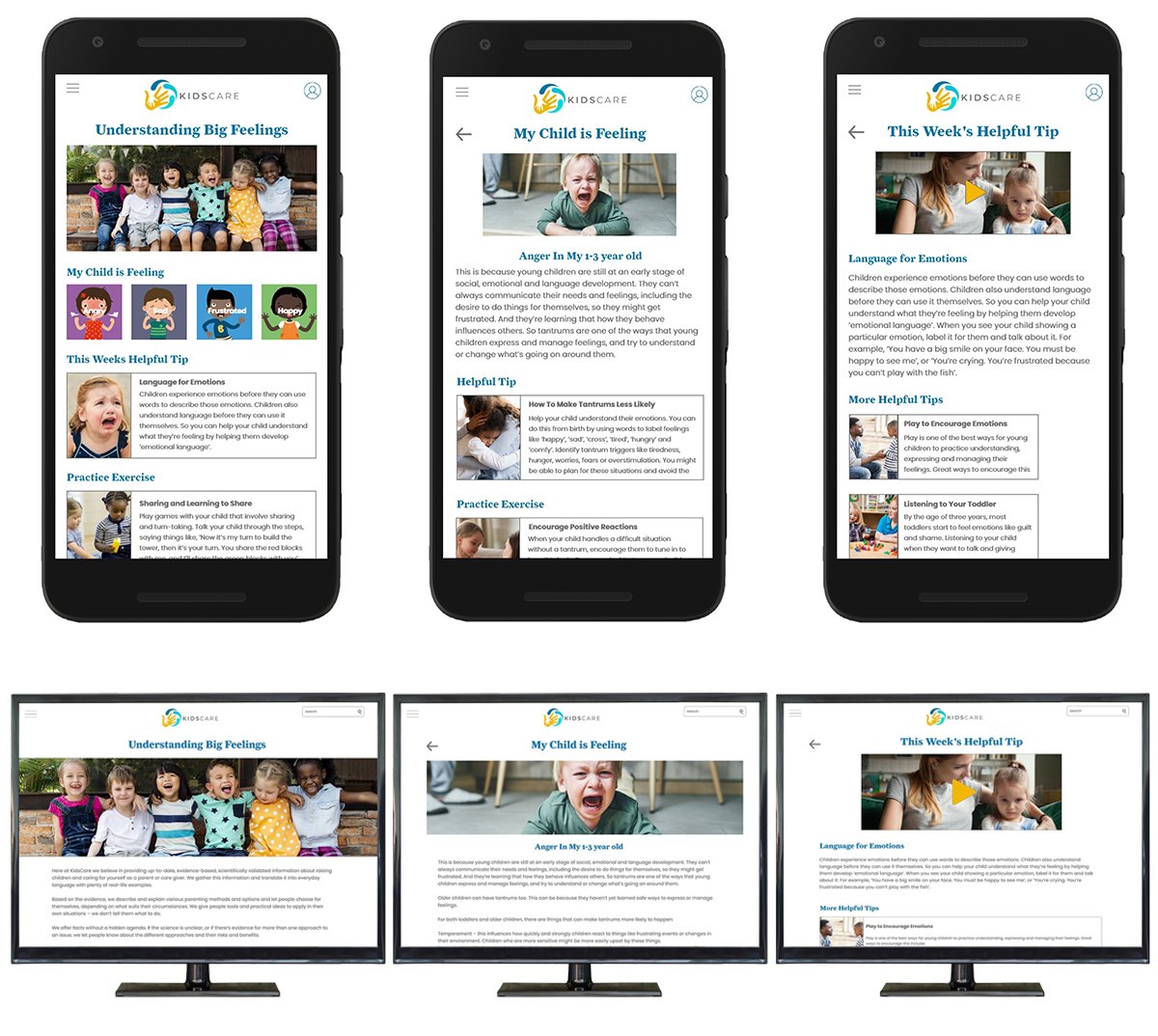
KidsCare - Understanding Young Children’s Emotions
KidsCare is an organization that aims to help parents understand their young child’s emotions so they can learn how to help their child work through their big feelings. They need a dedicated mobile app and website built for their readers. As a parent of twin toddlers I understand the frustrations of the up and downs of their young emotions.
My Responsibilities
Conducting interviews, paper and digital wireframing, low and high-fidelity prototyping, conducting usability studies, accounting for accessibility, and iterating on designs.
Users and Research
I conducted interviews and created empathy maps to understand the users I’m designing for and their needs. A primary user group identified through research was parents and caregivers of young children.
Paper Wireframes
LoFi Prototype
LoFi to HiFi Mobile


